
Packaging has come a long way from merely being a container that delivers the products inside. Nowadays, it is recognised as a key contact point between the customer and the brand.
An irresistible packaging design is beneficial in several ways: it attracts attention on a busy retail shelf, supplies information about the product and engages customers through multiple senses before purchase and use.
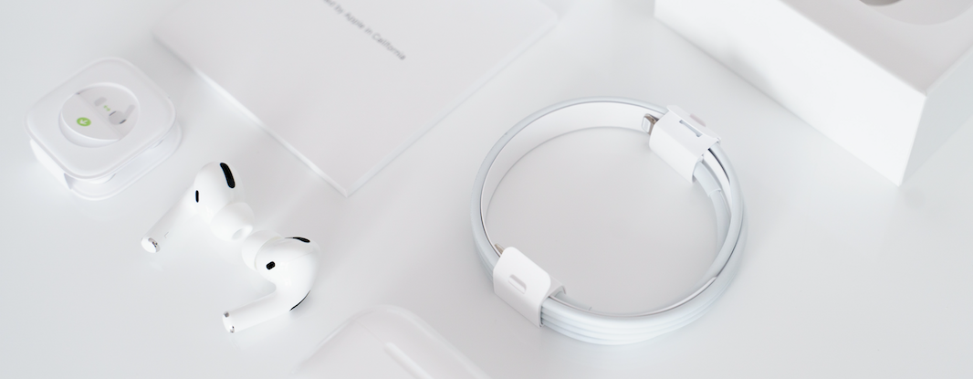
Several YouTube videos focus on ‘unboxing’ Apple products, highlighting the sleek design and ease of opening the package. The Apple unboxing case shows how packaging design plays a crucial role in uplifting customer experience and increasing brand engagement.
This brings us to the question, what is an irresistible pack design made of? Are there any guidelines on how to design packaging that attracts the customer’s attention and increases their likelihood of buying the product?
To answer these, Cambri’s research team did a deep dive into the academic literature on pack designs. We explored top-cited academic articles from eight distinguished marketing journals and found useful insights on creating an irresistible pack design. To clarify, we define irresistible pack designs as those which make purchasing and consumption easy and engaging and take the brand image in the desired direction. Our findings relate mostly to fast-moving consumer goods and are based on research with multiple methods: eye-tracking (lab and in store), in-store shopping tracking, image flashing and lab and in-store preference experiments.
The academic research investigation informed us that an irresistible pack design has several ingredients. They can be best understood by going through a typical customer journey and the role packaging plays in each stage of the customer journey:
- Stage 1: Attracting customer attention
- Stage 2: Providing information and setting expectations about the product
- Stage 3: Engaging customers with multiple senses
- Stage 4: Enhancing experience during consumption
In each of the four stages described above, different layers of packaging are crucial in creating product engagement, influencing purchase intent and affecting consumption.
Stage 1: Attracting attention
This is the first and often most crucial stage where a proper pack design can make a substantial difference. As customers walk into a retail store, they are bombarded with several competing pack designs, marketing claims, store displays and promotions. It's difficult to get the customer’s first attention among this plethora of information.
How to use packaging design to stand out from the competition?
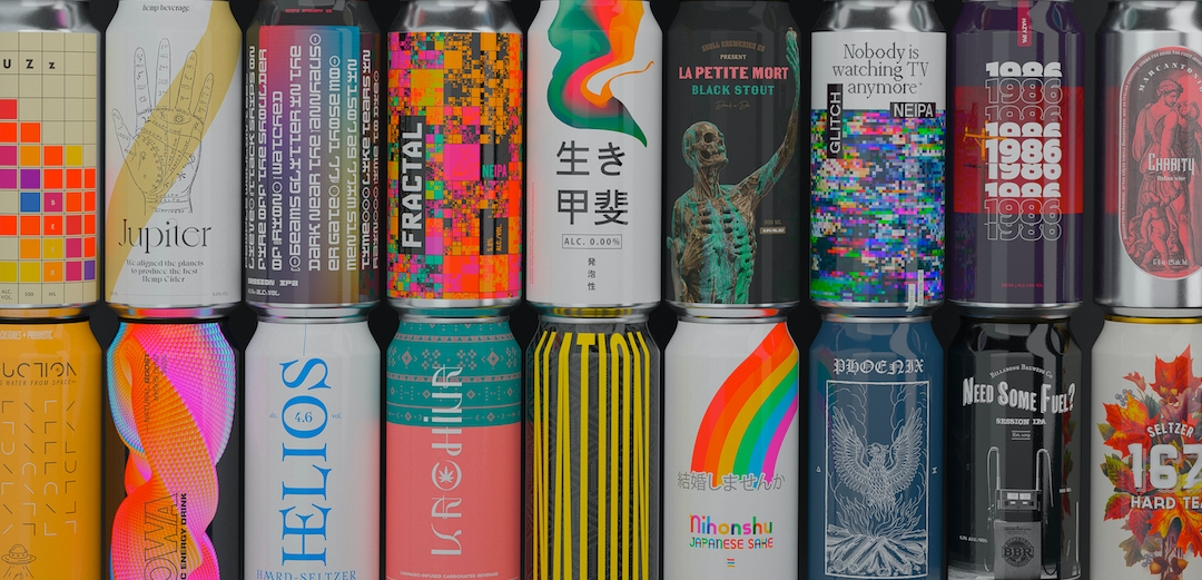
An irresistible packaging design can attract customers’ first attention by being visually distinctive from its surroundings. This can be done either by having more design elements than the competitors or by sporting a simpler pack design than customers expect from the category. The explanation for this is that customers will react favourably to elements that defy expectations because they are enticed to explore why the design is different from other comparable products. To illustrate, studies on fruit jams have shown that jam jars which are taller and slimmer compared to competitors are more successful in attracting first attention as the customer notices the unexpected jar shapes.
Research also shows that brands cannot go too far. In the early 90s, Pepsi created a new caffeine-free version called Crystal Pepsi. This version had transparent packaging and no colour, i.e., the product looked like clear soda and didn’t have a distinctive cola colour. However, when launched the customer response was quite negative to the new offering. One key reason for this is that the brand strayed too far and defied customer expectations too much. Thus, pack design needs to fit the product category and meet consumer expectations.
How to use pack layout to attract attention?
Another way to be visually distinctive is by having a clever packaging layout. Research shows that the ideal location of the key message is at the centre of the pack because customer's eyes look at the centre of the package first. Therefore, key messages or images should be placed at the centre of the pack to ensure customers immediately pay attention to those and are attracted to the product. If the centre is occupied, to maximise recall, words should be placed on the right-hand side and images on the left-hand side of packs. The reason for this is that the left side of the brain (which focuses on the right side of the pack) processes verbal material and the right side of the brain (which focuses on the left side of the packaging) processes visual material.
Stage 2: Providing information and setting expectations about the product
After getting attracted and giving their first attention, customers now focus on the specific product and are seeking more information consciously or unconsciously. At this stage, the customer wants to know more about the product’s rational as well as experiential benefits. For food products, consumers often cannot easily infer the benefits they consider most important (e.g. healthiness, freshness, deliciousness, etc.). For this reason, customers tend to be overly dependent on design cues and packaging-based marketing claims.
From our academic investigation, we found that experiential information such as deliciousness is more easily understood by customers when placed at the bottom of the packaging. On the other hand, rational/scientific information (e.g. healthiness, sugar content, etc.) is more easily understood when placed higher up on the packaging. This is because customers associate the brain (rational) to be located on the top, whereas the heart (experiential) is located lower in the body. These associations are unconsciously extended to match the information on the design packaging.
Furthermore, research in the snacks category (e.g. crisps) shows that descriptions mentioning multiple senses (e.g. crunchiness, appetising smell, good mouthfeel) are more influential than descriptions mentioning taste only because they lead consumers to better imagine what it is like to eat the snack. In addition, showing how the snack looks can lead customers to better imagine the snack’s taste, feel, smell, look and sound while eating.
How to place brand logos correctly?
At this stage of information gathering by customers, product brands can be particularly useful in convincing customers about high quality and leveraging their trust in making purchase decisions. However, it is vital to place the brand logo in the correct position on the packaging. Studies show that for strong brands, customers prefer the brand logo to be placed in a high position. Conversely, for new/lower market share brands, customers prefer the logo to be placed in a low position on the pack. This is because customers have a mental power structure of brands, and they expect strong brands to be high and present the product, while weaker brands should be low and can get sympathy as the underdog.
How to use pack shapes effectively?
Other than the placement of images, claims and brand logo, the shape of the pack can be effectively used to advantage. Investigating muesli packs, studies show that longer/taller containers are perceived by customers to have more volume than shorter and wider containers, making customers believe they get more value for their money. In addition, customers expect food in rounded pack shapes to have sweeter tastes as compared to those in more angular pack shapes.
When reducing pack sizes to save costs, it is recommended to reduce all 3 dimensions of the pack (length, width and depth) at the same time because customers are less likely to negatively notice the reduced size if all dimensions are simultaneously reduced.
How to use colours to convey product and brand attributes?
Finally, pack colours also guide customers to get knowledge about the expected texture, price, sustainability, taste intensity, etc. of the product. Customers expect products in high colour saturated packaging to have a more intense taste. However, some components of packaging are preferred to have a simpler/white colour: for example, customers prefer juice bottles with white caps over other colours as white is a socially familiar symbol of clarity, naturalness and purity.
Packaging colour also informs customers about the price or other brand values, e.g. black packaging may hint at premium products, bright orange hints at a bargain/discounted product, and green packaging signifies organic products. The packaging shape and colour also have a correlation; a rounded shape is better correlated with low saturated colour, and an angular shape is better correlated with a highly saturated colour. This correlation is because angular shapes are more stimulating (as compared to rounded), and they match with higher saturated colours.
Stage 3: Engaging customers with multiple senses
An irresistible pack design is not limited to only conveying information about the product. Instead, it also deepens the purchase experience by engaging the customer through multiple senses. Moving beyond stage two, in this stage customers may pick up the product from the retail shelf and connect more using senses beyond sight.
Increasing engagement with smells, touch and sound
Pack designs can increase engagement with smells, touch and sounds. For food and other consumer products that focus on scents, e.g. perfumes, pack designs that incorporate a scratch-and-sniff strip entices customers to smell the product. Similarly, for coffee packaging, a smell-hole can help customers to figure out the freshness and aroma of coffee inside the pack while simultaneously increasing the shelf-life of the pack.
Research also shows that packaging with an unusual texture or a surface that hints at the texture of the product inside may enhance engagement and willingness to purchase. Exploring cookie containers, research shows that for tins with a rough exterior, customers perceive the cookies inside to be also crunchier in texture. This makes the customers perceive the quality and eating experience of the cookies to be superior and may help in making a positive purchase decision.
Finally, the sound that packaging makes when picking it up from the retail shelf or trying the product may also enhance engagement. To illustrate, the sharp click of a pen/marker cap may be pleasant for customers to hear as it proves superior quality and a promise that the ink will not dry out while using the product. Similarly, the sound of a beverage can being opened may entice the customer to drink the beverage and therefore increase their probability of buying it.
Increasing engagement with imagery
Research shows that for food packaging, the eating cutlery, e.g. spoons, should be shown in the correct orientation to match the customer’s hand orientation. To illustrate, on soup packaging, the spoons may be shown as placed in the soup bowl in a way that a right-handed person could easily imagine using the spoon to eat the soup. This orientation match helps the customer to imagine consuming the product and increases their willingness to purchase.
Motion and dynamism in the imagery also actively engage customers, e.g. if the brand logo or any other image is represented as moving/having motion then customers are more engaged with the pack as they perceive it to be an active object.
Increasing engagement with colours
Colours can also be used to deeply engage customers subconsciously. Studies show that colours in the blue range may bring about feelings of relaxation while colours in the red range excite customers. Staying in the same colour range but varying the saturation, higher-saturation colours generate excitement and lighter colours bring about feelings of relaxation.
Research in consumer appliances packaging shows that black-and-white images make customers focus on the core product attributes as compared to the accessory/additional features. In addition, darker coloured packaging is considered sturdier and more durable as darker colours make customers perceive the product to be heavier and sturdier.
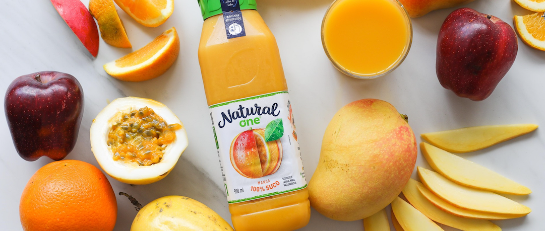
Finally, for certain food categories, e.g., juice packaging designs having similar colours to the product inside create harmony and signify a high-quality product. To illustrate, customers expect orange juice to have orange packaging and grape juice to have green or purple packaging.
Stage 4: Enhancing experience during consumption
In the final stage, the customer has bought the product and is going to use/consume it. Packaging plays a vital role in this stage as well where it can enhance or have an influence on the consumption experience. The intermediate layers of packaging, which are visible generally after the outer layer has been taken off, can enhance the consumption experience by supplying a symbolic luxury experience. For example, in chocolate packaging, an intermediate layer of golden or silverish foil packaging may give an appearance of a premium product to the customer. Another way in which intermediate packaging can influence consumption experience is by suggesting consumption sizes. For example, providing partitions in cookie boxes, or providing standard packed washing machine tablets helps the customers to use the product in optimal amounts.
Key insights and how Cambri helps you to create irresistible pack design.
From the research findings, a few crucial points stand out:
- Irresistible pack designs stand out visually from the category so that they become noticed first.
- Irresistible pack designs have clever layouts. Key visuals, key benefits and brand logos are positioned so that they capture consumer attention fast and evoke interest. Consumer investigation starts at the centre of the packaging.
- Shapes, colours and sensory properties such as smell, touch and sound evoke consumer imagination of what it is like to use the product and thus increase the likelihood of purchase.
- To summarise, irresistible pack designs have high visual distinctiveness, attract attention, create rational and emotional engagement, increase the willingness to purchase as well as efficiently communicate brand values.
Create irresistible pack designs with Cambri
We want to empower teams to run pack design development in an iterative test-and-learn manner because it is known to bring the best commercial outcome. We encourage you to take the following steps:
- Step 1: Start with Cambri’s category driver test (MaxDiff). You will identify what drives consumer choice and what the ranking among consumer benefits is. If needed, you can also run consumer segmentation simulations based on consumer preferences. These insights inform packaging design (briefing): what should be highlighted in the packaging and what not?
- Step 2: Continue with Cambri’s pack design tests as an A/B test. You will learn how well tested designs stand out in retail vs. key competitors, as well as what in the pack captures attention, and what is liked/disliked after consumers take a closer look. The insights help you to make design choices but equally, improve designs so that the likelihood of purchase is increased. Cambri’s stated eye-tracking method provides these valuable insights.
Authors
- Dr. Apramey Dube, Senior Research Manager, Cambri
- Dr. Heli Holttinen, CEO & Founder, Cambri
Sources:
- Chitturi R., Londono J.C., and Amezquita C.A. (2019), “The influence of color and shape of package design on consumer preference: The case of orange juice”, International Journal of Innovation and Economic Development, 5(2), pp. 42-56.
- Velasco C. and Spence C. (2014), “On the multiple effects of packaging color on consumer behavior and product experience in the ‘food and beverage’ and ‘home and personal care’ categories”, Food Quality and Preference, 68, pp. 226-237.
- Krishna A., Cian L., and Aydinoglu N.Z. (2017), “Sensory aspects of package design”, Journal of Retailing, 93 (1), pp. 43-54.
- Velasco C., Salgado-Montejo A., Marmolejo-Ramos F., and Spence C. (2014), “Predictive packaging design: Tasting shapes, typefaces, names, and sounds”, Food Quality & Preference, 34, pp. 88-95.
- Hagtvedt, H. (2014), “Dark is Durable, Light is Convenient: Color Value Influences Perceived Product Attributes,” Advances in Consumer Research, 42, pp. 28–9.
- Wei, S-T., Ou L-C., Luo M.R., and Hutchings J.B. (2014), “Package Design: Color Harmony and Consumer Expectations”, Journal of Design, 8 (1), pp. 109-126.
- Clement J., Kristensen T., and Grønhaug K. (2013), “Understanding consumers' in-store visual perception: The influence of package design features on visual attention”, Journal of Retailing & Consumer Services, 20, pp. 234-239.
- Schifferstein H., Fenko A., Desmet P., Labbe D., and Martin N. (2013), “Influence of package design on the dynamics of multisensory and emotional food experience”, Food Quality & Preference, 27, pp. 18-25.
- Ares G. and Deliza R. (2010), “Studying the influence of package shape and color on consumer expectations of milk desserts using word association and conjoint analysis”, Food Quality & Preference, 21 (8), pp. 930-937.
- Deng, X. and Kahn, B.E. (2009), “Is your product on the right side? The “location effect” on perceived product heaviness and package evaluation”, Journal of Marketing Research, XLVI, pp. 725-738.
- Rettle R. and Brewer C. (2000), “The verbal and visual components of package design”, Journal of Product & Brand Management, 9 (1), pp. 56-70.